
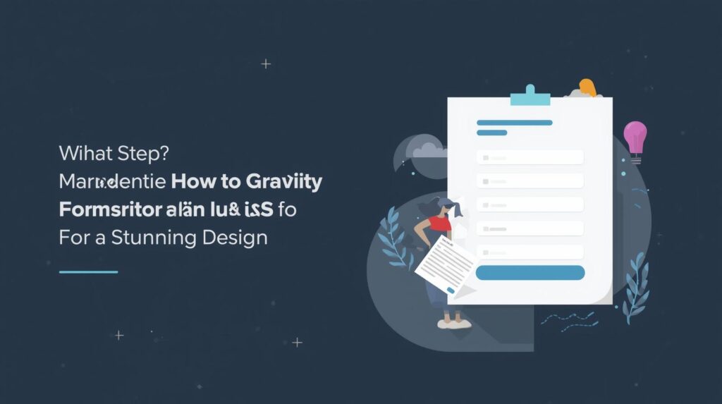
Introduction: Why Your Gravity Forms Deserve a Makeover
Imagine this: a visitor lands on your beautifully designed website, scrolls through your compelling content, and finally reaches your contact form — only to find a bland, default-looking form that ruins the aesthetic harmony.
That’s the silent killer of conversions!
In digital marketing and user experience design, first impressions matter. A well-styled form doesn’t just collect data — it reflects your brand identity, improves user engagement, and drives higher conversion rates.
This is why learning how to style your Gravity Forms with custom CSS is one of the most underrated skills every WordPress user should master.
In this guide, you’ll discover step-by-step how to customize your Gravity Forms with CSS, including pro design tips, color strategies, and real-world examples that make your forms stand out like a polished diamond on your website.
🧩 What Are Gravity Forms? (And Why Marketers Love Them)
Gravity Forms is one of the most powerful form builder plugins for WordPress. It allows you to create everything from simple contact forms to complex multi-step applications, surveys, and payment forms — without writing a single line of code.
But the beauty of Gravity Forms lies not just in its functionality — it’s in its flexibility. You can style every element of your form to match your website’s branding using custom CSS.
💡 Pro Insight: According to Form Conversion Reports, well-styled forms improve completion rates by up to 35% compared to generic ones.
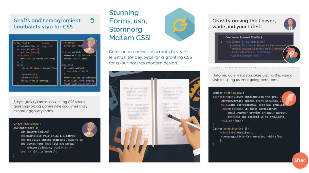
🎨 Why Use Custom CSS for Gravity Forms?
Although Gravity Forms includes some basic styling options, these are often not enough for unique brand customization. That’s where CSS (Cascading Style Sheets) comes in — it gives you full control over layout, typography, colors, and spacing.
Here are key benefits:
✅ Brand Consistency: Match your forms with your website’s theme colors and fonts.
✅ Improved Readability: Better spacing and contrast help users fill out forms easily.
✅ Enhanced User Experience: Stylish, intuitive forms increase conversions.
✅ Mobile Optimization: You can tweak padding and sizing for responsiveness.
✅ Professional Edge: Custom styling makes your forms look like part of your design — not an afterthought.
🧠 Understanding Gravity Forms CSS Structure
Before styling, it’s crucial to understand Gravity Forms’ basic CSS structure. Each form element has a specific CSS class, such as:
| Element | CSS Class | Description |
|---|---|---|
| Form Wrapper | .gform_wrapper | The main container of the form |
| Form Fields | .gfield | Each individual field |
| Labels | .gfield_label | The text label for each input |
| Input Fields | .medium, .large, .small | Field size classes |
| Buttons | .gform_button | Submit button styling |
| Error Messages | .validation_message | Form validation alerts |
🧭 Tip: Use your browser’s Inspect Tool (Right-click → Inspect) to identify and test styles live before applying them permanently.
⚙️ How to Add Custom CSS to Gravity Forms (3 Easy Methods)
Method 1: Add CSS via WordPress Customizer
- Go to Appearance → Customize → Additional CSS.
- Paste your custom CSS code.
- Click Publish to save changes.
Example:
body .gform_wrapper .gfield_label {
  font-weight: 600;
  color: #1a1a1a;
  font-size: 16px;
}
Method 2: Add CSS via Your Theme’s Stylesheet
You can add styles in your theme’s style.css file (or via a child theme).
Example:
.gform_wrapper input[type="text"],
.gform_wrapper textarea {
  border-radius: 10px;
  border: 1px solid #ccc;
  padding: 12px;
  width: 100%;
  font-size: 15px;
  transition: border-color 0.3s ease;
}

.gform_wrapper input[type="text"]:focus {
  border-color: #0073e6;
  outline: none;
}
This approach keeps your styles permanent — even if the plugin updates.
Method 3: Use a Custom CSS Plugin
If you don’t want to edit files directly, install a plugin like Simple Custom CSS or WP Add Custom CSS.
Then, target specific forms using the form ID:
Example:
body #gform_wrapper_1 {
  background: #f9f9f9;
  padding: 20px;
  border-radius: 15px;
  box-shadow: 0 0 10px rgba(0,0,0,0.1);
}
🪄 Pro Tip: You can target individual forms using their unique ID —
#gform_wrapper_1for Form 1,#gform_wrapper_2for Form 2, and so on.
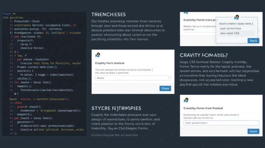
💡 Gravity Forms Styling Examples (Copy + Paste Templates)
1. Minimalist Form Design
.gform_wrapper .gfield_label { display: none; }
.gform_wrapper input,
.gform_wrapper textarea {
  border: none;
  border-bottom: 2px solid #ddd;
  background: transparent;
  width: 100%;
  padding: 8px;
}
.gform_wrapper .gform_button {
  background-color: #000;
  color: #fff;
  border: none;
  padding: 12px 25px;
  border-radius: 5px;
}
🖼️ Visual Inspiration:
2. Modern Gradient Button Style
.gform_wrapper .gform_button {
  background: linear-gradient(90deg, #ff7e5f, #feb47b);
  color: white;
  font-weight: bold;
  text-transform: uppercase;
  border: none;
  border-radius: 30px;
  padding: 12px 35px;
  transition: all 0.3s ease;
}

.gform_wrapper .gform_button:hover {
  background: linear-gradient(90deg, #feb47b, #ff7e5f);
}
📸 Infographic Idea: A “before vs after” visual showing a default Gravity Form versus a custom CSS-enhanced one.
3. Floating Label Effect
.gform_wrapper .gfield input:focus + label,
.gform_wrapper .gfield textarea:focus + label {
  transform: translateY(-20px);
  font-size: 12px;
  color: #0073e6;
}
This trendy design creates a sleek, app-like form experience.
📊 Pro Design Tips for Better Gravity Form UX
✅ Use ample white space: Don’t clutter — let each field breathe.
✅ Highlight active fields: Use subtle animations to show focus states.
✅ Color psychology: Use brand-aligned colors that build trust (e.g., blue for reliability, green for growth).
✅ Consistency: Keep button styles consistent across your website.
✅ Mobile-first approach: Test your forms on multiple devices.
📈 Fact: Google’s UX Report shows mobile-friendly forms can boost submission rates by up to 27%.
🔧 Bonus: Using Gravity Forms CSS Ready Classes
Gravity Forms includes ready classes you can add directly within the form editor:
| Ready Class | Purpose |
|---|---|
gf_left_half | Places field on the left half |
gf_right_half | Places field on the right half |
gf_inline | Displays fields inline |
gf_list_inline | Displays checkboxes inline |
👉 Add these in the Field Settings → Appearance → Custom CSS Class box to instantly change layouts — no coding needed!
🧰 Troubleshooting Common CSS Issues
If your custom styles don’t apply:
- Clear your website cache (especially if using caching plugins).
- Use specific selectors to override plugin defaults.
- Add
!importantfor stubborn rules. - Make sure your theme doesn’t have conflicting CSS.
Example:
.gform_wrapper .gform_button {
  background-color: #000 !important;
}
🧠 Advanced Option: Targeting Conditional Logic and Multi-Page Forms
For multi-step or conditional forms, use these classes:
| Element | CSS Class |
|---|---|
| Progress Bar | .gf_progressbar |
| Active Page | .gf_page_active |
| Next/Previous Buttons | .gform_next_button, .gform_previous_button |
Example:
.gform_wrapper .gf_progressbar {
  height: 8px;
  background-color: #e0e0e0;
  border-radius: 10px;
}
.gform_wrapper .gf_progressbar_percentage {
  background-color: #00b894;
  border-radius: 10px;
}
🖼️ Infographic Idea: Show a visual of a styled multi-step Gravity Form with progress tracking.
❓ FAQs: Styling Gravity Forms with Custom CSS
Q1. Can I use page builders like Elementor with Gravity Forms?
Yes! Gravity Forms integrates seamlessly with Elementor and other builders — you can style them using both visual controls and CSS.
Q2. Will updates break my custom CSS?
Not if you use a child theme or a custom CSS plugin. Avoid editing plugin core files.
Q3. Can I use Google Fonts or custom typography?
Absolutely. Import Google Fonts into your theme or CSS file and apply them to your form elements.
Q4. What’s the best font size for readability?
Typically, 15–17px works best for input text, with 16–18px for labels.
Q5. Is there a CSS framework for Gravity Forms?
Yes, you can integrate frameworks like Bootstrap or Tailwind CSS, but ensure you override default Gravity Forms classes properly.
✨ Conclusion: Transform Your Forms, Transform Your Brand
Your form isn’t just a data collection tool — it’s a conversion engine.
With a few lines of custom CSS, you can turn a dull Gravity Form into a sleek, professional, and brand-aligned masterpiece that users enjoy filling out.
As EduKester always says:
💬 “Design is not just what it looks like — it’s how it works.”
So go ahead — experiment, test, and style your Gravity Forms with confidence. Make every form a reflection of your creativity and brand excellence.
📝 Notes
Meta Description:
Learn how to style your Gravity Forms with custom CSS. Step-by-step guide with examples, visuals, and pro tips to design stunning, brand-aligned forms that convert.
Tags:
Gravity Forms, WordPress Forms, Custom CSS, Web Design, UX Optimization, CSS Styling, Form Design, WordPress Tips, EduKester, UI Enhancement
Long-Tail Keywords:
- How to style Gravity Forms with CSS
- Gravity Forms custom CSS examples
- Gravity Forms design tutorial
- Best CSS for WordPress forms
- Customize Gravity Forms’ appearance
Would you like me to design the infographics and visuals (with my brand “EduKester”) for this post next? I can generate high-quality images for:
- “Before vs After Form Design”
- “CSS Structure of Gravity Forms”
- “3-Step Styling Process”
- “Mobile-Friendly Form Layout Example.”
Just comment below, and I will respond to you.


I really like your blog.. very nice colors & theme.
Did you design this website yourself or did you hire someone to do it
for you? Plz respond as I’m looking to design my own blog and would like
to know where u got this from. appreciate it
I designed by myself, this is just one, you can check other one, https://rankests.com , https://auditest.online ,https://chris.com.ng , https://droppic.com.ng and many more. kindly send me email at infochrisior@gmail.com or contact@rankests.com
I really like your blog.. very nice colors & theme.
Did you design this website yourself or did you hire someone to do it
for you? Plz respond as I’m looking to design my own blog and would like
to know where u got this from. appreciate it
Thank you. kindly send me email at infochrisior@gmail.com or contact@rankests.com
Hi there, just wanted to say, I loved this blog post.
It was inspiring. Keep on posting!
Hello there! Quick question that’s totally off topic.
Do you know how to make your site mobile friendly? My weblog looks weird when browsing from my iphone 4.
I’m trying to find a template or plugin that might be able to fix this issue.
If you have any recommendations, please share. Cheers!
Kindly email me at infochrisior@gmail.com, if possible, let redesign it on mobile friendly.
This is my first time visit at here and i am in fact impressed
to read all at single place.
Very quickly this website will be famous among all blogging viewers, due to it’s nice content
unblocked games
Hi, Neat post. There’s a problem along with your website in web explorer, would test this?
IE nonetheless is the marketplace chief and a big part of other people will pass over your great writing due to this problem.
Right here is the perfect site for anyone who wishes to understand this topic.
You understand a whole lot its almost hard to argue with you (not that I personally will need to…HaHa).
You certainly put a brand new spin on a topic
which has been written about for decades. Excellent
stuff, just great!
It is perfect time to make a few plans for the longer term and it’s time
to be happy. I’ve learn this submit and if I may just I desire to recommend
you some fascinating things or suggestions. Perhaps you could write subsequent
articles relating to this article. I want to read even more issues
about it!
Thank you
I just like the helpful information you supply on your articles.
I’ll bookmark your blog and test once more right here frequently.
I am somewhat sure I will be informed many new stuff proper here!
Good luck for the following!
Thank you
Thank you a bunch for sharing this with all people you actually recognize what you are
speaking approximately! Bookmarked. Please also seek advice
from my web site =). We can have a hyperlink trade agreement among us
what advice are you looking for? kindly send me email at infochrisior@gmail.com or contact@rankests.com
I am regular reader, how are you everybody? This piece of writing posted at this web page is genuinely fastidious.
I think this is among the most vital info for me. And i am glad reading your
article. But wanna remark on few general things, The web site style
is ideal, the articles is really excellent : D. Good job, cheers
Hi there, I found your web site via Google even as looking
for a related topic, your web site got here
up, it seems good. I’ve bookmarked it in my google bookmarks.
Hello there, just become alert to your blog through Google, and
located that it is really informative. I’m gonna be careful for brussels.
I will be grateful if you happen to proceed this in future.
Lots of other folks might be benefited from your writing.
Cheers!
I’ve been surfing online more than 2 hours today, yet I neer found any interesting article like yours.
It is pretty worth enough for me. In my opinion, iif alll site ownbers and bloggers made good content as you did, the
web will be much more useful than ever before. http://boyarka-inform.com/
Appreciation to my father who informed me concerning
this blog, this web site is truly awesome.
Yes! Finally something about a.
Hi, Neat post. There is an issue along with
your website in internet explorer, might check this?
IE nonetheless is the marketplace chief and a huge element
of other people will miss your excellent writing due to this problem.
I will check it out
Hi there I am so happy I found your blog page, I really found you
by error, while I was looking on Aol for something
else, Nonetheless I am here now and would just like to say thanks a lot for a fantastic post and a all round exciting blog (I
also love the theme/design), I don’t have time to read it all at the
moment but I have saved it and also included your RSS feeds, so
when I have time I will be back to read a great deal more, Please
do keep up the fantastic job.
An interesting discussion is worth comment.
There’s no doubt that that you ought to publish more on this topic, it
might not be a taboo matter but generally people don’t
discuss these subjects. To the next! Many thanks!!
I am regular visitor, how are you everybody? This paragraph posted at
this web siite is genuinely pleasant.
Also visit my blog post :: bokep Indonesia
It is not my first time to pay a quick visit this website, i am browsing this web page dailly and take good facts from here
all the time.
Awesome article.
Thank you a bunch for sharing this with all folks you actually recognize what you are talking about!
Bookmarked. Please also consult with my web site =). We
may have a hyperlink exchange contract among us
Okay, no problem
That is very attention-grabbing, You’re a very skilled blogger.
I’ve joined your rss feed and look ahead to searching for more of your great post.
Additionally, I’ve shared your web site in my social networks
Appreciation to my father who informed me on the topic of this webpage, this website is really amazing.
Here is my blog: porn
I all the time used to study post in news papers
but now as I am a user of internet therefore from now I am using net
for articles, thanks to web.
each time i used to read smaller posts that also clear their motive, and that is also happening with this post which I am reading at this place.
Hi my family member! I want to say that this post is awesome, great written and come with almost all significant infos.
I’d like to look extra posts like this .
Thank you
This design is steller! You obviously know how to keep a reader entertained.
Between your wit and your videos, I was almost moved
to start my own blog (well, almost…HaHa!) Fantastic job.
I really enjoyed what you had to say, and more than that,
how you presented it. Too cool!
Thank you, kindly join me to start yours, is good to share ideas with people.
I’ve been browsing online more than 3 hours today, yet I never found any interesting article like yours.
It’s pretty worth enough for me. In my view,
if all webmasters and bloggers made good content as you did, the
web will be much more useful than ever before.
Thank you very much
If some one desires expert view concerning blogging and site-building afterward i propose him/her
to pay a visit this weblog, Keep up the pleasant work.
Thank you
It’s awesome to go to see this site and reading the views of all mates
concerning this post, while I am also zealous of getting knowledge.
What’s up everyone, it’s my first visit at this
web page, and piece of writing is truly fruitful for me, keep up posting
such articles.
Thank you
Hello, I think your site might be having browser compatibility issues.
When I look at your blog site in Opera, it looks fine but when opening in Internet Explorer, it has some overlapping.
I just wanted to give you a quick heads up!
Other then that, great blog!
I will check it out thank you
Hello there I am so grateful I found your blog, I really found you by mistake, while
I was researching on Digg for something else,
Anyways I am here now and would just like to say thanks a
lot for a tremendous post and a all round entertaining blog (I also love the theme/design), I don’t have
time to read through it all at the moment but I have bookmarked
it and also added in your RSS feeds, so when I have time I will
be back to read more, Please do keep up the superb jo.
Thank you very much
Hi there, just became alert to your blog through Google, and found that it’s really informative.
I am gonna watch out for brussels. I will be grateful if you continue this in future.
Many people will be benefited from your writing.
Cheers!
Thank you
I’m gone to inform my little brother, that he should also pay a
quick visit this blog on regular basis to obtain updated from newest reports.
Thank you
It’s very easy to find out any matter on web as compared
to books, as I found this article at this web page.
Hello there! This is kind of off topic but I need some help from an established blog.
Is it difficult to set up your own blog? I’m not very techincal but I can figure things out pretty fast.
I’m thinking about setting up my own but I’m not sure where to begin. Do you have any points or suggestions?
With thanks
Yes, you can start with wordpress, is the best, however, there are others options, like medium, tumblr blogger, is free to have your website using this platforms. but for professional website, eordpress is the best, i can help you out, Kindly email me at infochrisior@gmail.com.
Hello, i feel that i noticed you visited my blog so i got here
to return the prefer?.I’m attempting to in finding things to improve my
web site!I suppose its adequate to make use of some of your concepts!!
Hi there! I just wanted to ask if you ever have any trouble with hackers?
My last blog (wordpress) was hacked and I ended up losing a few months
of hard work due to no backup. Do you have any solutions to prevent hackers?
Yes, i experience the issue with this website also, but i was able to recovered my site, like me, the simple methods i use was to add line of code to prevent further attacked.
Thanks for the marvelous posting! I quite enjoyed reading
it, you might be a great author.I will ensure that I bookmark your blog and
will often come back later on. I want to encourage you to definitely continue your great posts, have a nice weekend!
Fine way of telling, and good paragraph to take information concerning my presentation subject, which
i am going to deliver in university.
What’s up, I check your blogs on a regular basis.
Your humoristic style is witty, keep it up!
Thanks for your personal marvelous posting! I genuinely enjoyed reading
it, you happen to be a great author. I will always bookmark your blog and may come back very soon. I want to encourage one to continue your great writing, have
a nice day!
I’m not that much of a online reader to be honest but your sites really nice,
keep it up! I’ll go ahead and bookmark your site to
come back later. All the best
You have made some decent points there. I looked on the web for more info about the issue
and found most individuals will go along with your views
on this web site.
«Авиатор» — это увлекательная краш-игра, где игроки ставят на увеличение коэффициента, связанного с полетом самолета авиатор казино игровые автоматы.
Ваша задача — вовремя вывести деньги, прежде
чем самолет «разобьется».
Hi there, the whole thing is going nicely here and ofcourse every one is sharing facts, that’s truly fine, keep up writing.
Ahaa, its pleasant dialogue on the topic of this piece of writing here at this blog, I have read all that,
so now me also commenting at this place.
Have you ever thought about including a little bit more than just your
articles? I mean, what you say is important and all. Nevertheless just imagine if you added
some great visuals or video clips to give your
posts more, “pop”! Your content is excellent but with images
and video clips, this site could undeniably be one of the greatest in its
niche. Excellent blog!
Very nice article. I certainly love this site. Keep writing!
Howdy are using WordPress for your blog platform? I’m new to the blog world but
I’m trying to get started and create my own. Do you need any
coding knowledge to make your own blog? Any help would be greatly
appreciated!
I simply created this blog using wordpress, not coding, i can help you create one if you have interest, email me at infochrisior@gmail.com
Everything is very open with a really clear description of the challenges.
It was truly informative. Your site is useful.
Thanks for sharing!
Thank you, i appreciate your interest.
Hello! Would you mind if I share your blog with my myspace group?
There’s a lot of folks that I think would really appreciate your content.
Please let me know. Thanks
Go ahead please
Heya i’m for the first time here. I came across this board and I find It
really useful & it helped me out a lot. I hope to give something back and aid others like you helped me.
Okay, i am here for you, kindly share your issue, let solve it together. email me at infochrisior@gmail.com
Howdy! This article couldn’t be written much better!
Going through this post reminds me of my previous roommate!
He constantly kept preaching about this. I will send this information to him.
Pretty sure he will have a good read. Thank you
for sharing!
Thank you
I’m not sure why but this weblog is loading incredibly slow
for me. Is anyone else having this issue or is
it a problem on my end? I’ll check back later and
see if the problem still exists.
It may be your network, kindly check your network please.
After looking at a number of the blog posts on your site, I honestly appreciate your technique of blogging.
I added it to my bookmark webpage list and will be checking back soon. Please visit my website as well and
let me know how you feel.
Okay , thank you, i check out
I do not know whether it’s just me or if everyone else experiencing problems
with your blog. It looks like some of the text within your posts are running off the screen. Can someone else please provide feedback and let me know
if this is happening to them too? This might be a issue with my web browser because I’ve had this happen previously.
Cheers http://nksenterprises.uk/a-new-age-for-trade-supply-chain-finance-2/
I will check it out. thank you
These are truly wonderful ideas in on the topic of blogging.
You have touched some nice things here. Any way keep up
wrinting. http://116.63.173.179:8001/constancebusey/2865chatruletka-18-porn/wiki/Chat-video-free.
Thank you
Hmm it looks like your site ate my first comment (it was super long) so I guess I’ll just sum it up what I wrote and say,
I’m thoroughly enjoying your blog. I as well am
an aspiring blog blogger but I’m still new to everything.
Do you have any points for inexperienced blog writers?
I’d certainly appreciate it.
Thank you very much
With havin so much written content do you ever run into any
issues of plagorism or copyright infringement? My website has a lot of exclusive content I’ve either created myself or outsourced
but it seems a lot of it is popping it up all over the web without my permission. Do you know any
solutions to help prevent content from being ripped off?
I’d truly appreciate it.
Yes. you can find solution on my website https://rankests.com/plagiarism-checker , if you dont get the best results, kindly contact me at infochrisior@gmail.com
I every time used to study paragraph in news papers but now as I am a user
of net thus from now I am using net for posts, thanks to web.
Remarkable issues here. I am very glad to peer your post.
Thank you so much and I am having a look forward to contact you.
Will you please drop me a e-mail?
Send you email at
Infochrisior@gmail.com Thank you, i am waiting for you email.
What i don’t realize is in fact how you are no longer actually
a lot more well-liked than you might be now. You
are very intelligent. You know thus considerably with regards to
this subject, produced me in my opinion imagine it from numerous various angles.
Its like women and men don’t seem to be involved unless it’s something to accomplish with Woman gaga!
Your individual stuffs nice. All the time take care of it up!
Thank you
Wow, wonderful blog layout! How long have you been blogging for?
you made blogging look easy. The overall look of your website is excellent, let alone the content!
Thank you
Hello! This is kind of off topic but I need some advice from
an established blog. Is it very difficult to set up your own blog?
I’m not very techincal but I can figure things out pretty quick.
I’m thinking about setting up my own but I’m not sure where to start.
Do you have any tips or suggestions? With thanks
Yes please, how do you want to get started?
Aw, this was an incredibly nice post. Taking a few minutes and actual effort to
generate a top notch article… but what can I say… I hesitate a lot and
never manage to get nearly anything done.
When I initially commented I seem to have clicked the -Notify
me when new comments are added- checkbox and from now on every time a comment is added I receive four emails
with the same comment. Is there a means you can remove me from that service?
Appreciate it!
What’s up to every , since I am genuinely eager
of reading this blog’s post to be updated daily. It contains good information.
I’m really enjoying the design and layout of your
site. It’s a very easy on the eyes which makes it much
more enjoyable for me to come here and visit more often. Did you hire out a designer to create your theme?
Fantastic work!
I Thank you very much, i design it myself, if you need this type of design, kindly send me email at infochrisior@gmail.com or contact@rankests.com
Hi there, just became alert to your blog through Google, and found that it’s truly informative.
I am going to watch out for brussels. I’ll appreciate if
you continue this in future. Numerous people will be benefited from your writing.
Cheers!
It’s very straightforward to find out any topic on web as compared to books, as I found this piece of writing at this web
site.
Thank you, if you need a website, kindly send me email at infochrisior@gmail.com or contact@rankests.com
I was recommended this blog by my cousin. I’m not
sure whether this post is written by him as nobody else
know such detailed about my trouble. You are amazing!
Thanks!
Does your blog have a contact page? I’m having problems locating it but, I’d like to send you
an e-mail. I’ve got some creative ideas for
your blog you might be interested in hearing. Either
way, great blog and I look forward to seeing it grow over time.
kindly send me email at infochrisior@gmail.com
Hi there! I know this is kinda off topic but I
was wondering which blog platform are you using for
this website? I’m getting sick and tired of
Wordpress because I’ve had issues with hackers and I’m looking at options for another platform.
I would be awesome if you could point me in the direction of a good platform.
Sorry about that, i use wordpress for all my website and also my for my client, they never complain about attackers, however, i can help out, kindly send me email at infochrisior@gmail.com
Hi there! I could have sworn I’ve been to your blog before but after looking at many of the articles I realized it’s
new to me. Regardless, I’m certainly happy I found it and I’ll be bookmarking it
and checking back often!
Thank you
Have you ever thought about writing an e-book or guest authoring on other blogs?
I have a blog centered on the same ideas you discuss and would love to have you share some stories/information. I know my
visitors would appreciate your work. If you’re even remotely
interested, feel free to shoot me an email.
Okay, kindly contact me at infochrisior@gmail.com
Hey there, You have done an incredible job.
I’ll definitely digg it and personally suggest to my
friends. I am confident they’ll be benefited from this website.
You can definitely see your skills in the work you write. The world
hopes for even more passionate writers such as you who are
not afraid to mention how they believe. Always follow your heart.
Good day! I could have sworn I’ve been to
this site before but after checking through some
of the post I realized it’s new to me. Anyhow, I’m definitely happy I found it
and I’ll be book-marking and checking back frequently!
These are really enormous ideas in on the topic of blogging.
You have touched some good points here. Any way keep up wrinting.
I love reading through a post that can make people think.
Also, many thanks for allowing me to comment!
Hmm it looks like your website ate my first comment (it was
extremely long) so I guess I’ll just sum it up what I had written and say, I’m thoroughly enjoying your blog.
I as well am an aspiring blog writer but I’m still new to the whole thing.
Do you have any suggestions for inexperienced blog
writers? I’d definitely appreciate it.
When I initially commented I seem to have clicked the -Notify me when new comments are added- checkbox and from now on every time a comment is added I get
four emails with the same comment. There has to be a means you can remove me from that service?
Appreciate it!
Greetings I am so delighted I found your site, I really found you by mistake, while I was browsing on Bing for something
else, Anyhow I am here now and would just like to say many thanks for a marvelous post
and a all round exciting blog (I also love the theme/design),
I don’t have time to browse it all at the minute but I have book-marked it and also added your RSS feeds,
so when I have time I will be back to read a lot more,
Please do keep up the superb work.
This is a very informative post. I really appreciate how clearly everything
is explained, especially for people who are new to
online casino platforms.
The way you describe the features, usability, and overall
experience makes it easy to understand and compare with other websites.
I also like that the content focuses on safety, convenience, and user experience.
Thanks for sharing such useful information. I will definitely check out more articles on this
site.
I am sure this piece of writing has touched all the internet users, its really really good
paragraph on building up new website.
Hi there, I found your blog by means of Google whilst looking for a related subject,
your web site got here up, it appears good. I have bookmarked it in my google
bookmarks.
Hi there, simply was aware of your weblog via Google, and found that it’s truly informative.
I am gonna be careful for brussels. I’ll appreciate if you happen to
continue this in future. A lot of people
will probably be benefited from your writing. Cheers!
hello there and thank you for your info – I’ve definitely picked
up something new from right here. I did however expertise
several technical points using this website, as I experienced to reload the site many times previous
to I could get it to load correctly. I had been wondering if your hosting
is OK? Not that I’m complaining, but sluggish loading instances times will sometimes affect your placement in google and can damage your high-quality score
if ads and marketing with Adwords. Anyway I’m adding this RSS to my e-mail and
could look out for much more of your respective interesting content.
Make sure you update this again soon.
Hurrah! At last I got a weblog from where I be able to truly
take helpful information concerning my study and knowledge.
Fine way of explaining, and pleasant article to get information concerning my presentation subject, which i am going to convey in institution of higher education.
Pretty nice post. I just stumbled upon your blog and wished
to mention that I’ve really loved surfing around your weblog posts.
After all I’ll be subscribing in your feed and I hope you write once more very soon!
Hi! This post couldn’t be written any better! Reading this post reminds me of
my good old room mate! He always kept chatting about this.
I will forward this page to him. Pretty sure he will have a good read.
Many thanks for sharing!